BRENDING
1. CONCEPT
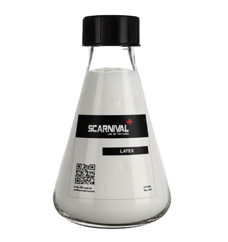
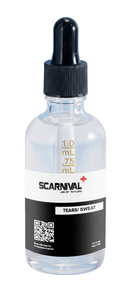
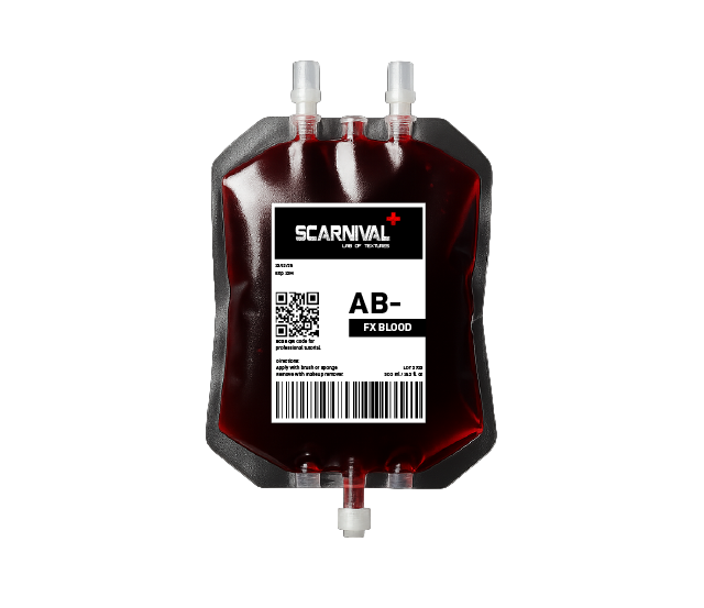
Scarnival is a special effects makeup brand built around the concept of a laboratory a controlled space for experimentation, precision, and material exploration. Guided by the slogan “Lab of Textures,” the brand presents SFX makeup as a research-driven process, where textures and formulas are refined to achieve hyper-realistic results. Drawing from medical and scientific visual languages, Scarnival balances clinical clarity with bold, material focused expression.
2.VISUAL LANGUAGE
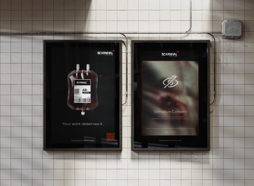
Scarnival’s visual language draws from medical and laboratory environments, using clean compositions, controlled lighting, and restrained framing. Products are presented as research objects rather than beauty items, emphasizing materiality, texture, and realism.
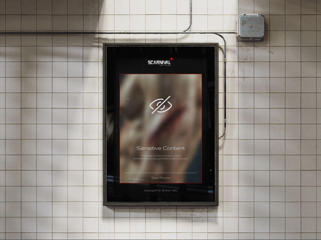
Images featuring wounds are intentionally censored not out of sensitivity, but as a conceptual statement.
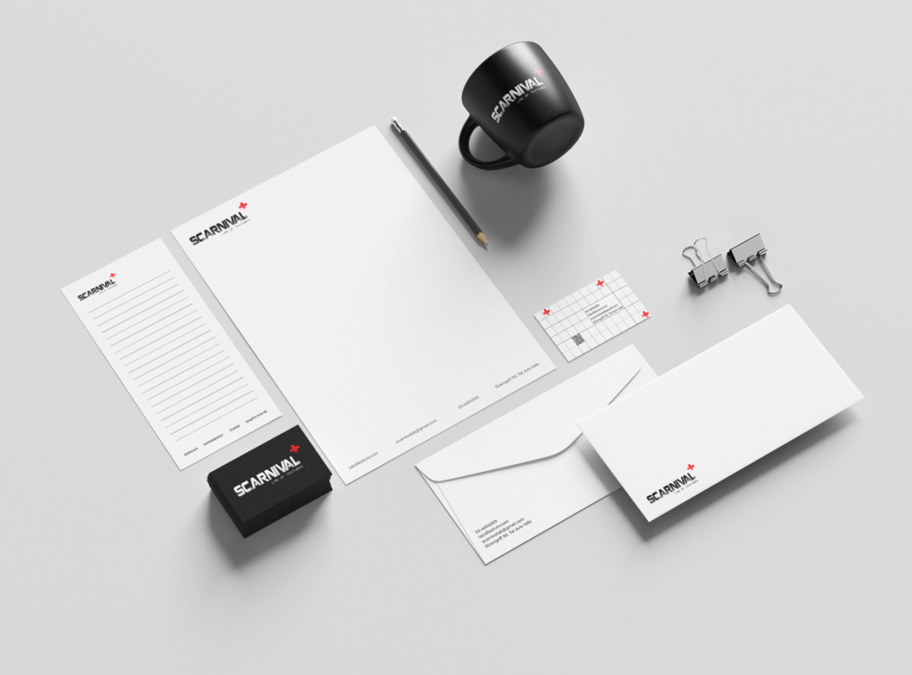
3.LOGO & COLOR PALLETE
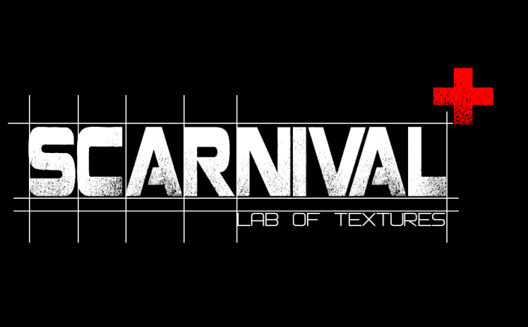

The logo is constructed with a bold, industrial typographic approach, inspired by medical labeling and laboratory markings. The red cross element functions as both a clinical reference and a warning sign, emphasizing professionalism while hinting at the graphic nature of the work. The system is designed to feel precise, technical, and unapologetically direct.
Scarnival’s color palette is rooted in stark contrasts clinical white, deep black, and saturated red. White and black reference medical environments, sterility, and precision, while red introduces the physical reality of the material: skin, blood, and texture. Together, the palette reinforces the tension between control and intensity that defines the brand.